Envisioning SourceCred 1.0

I’ve put together a proposal design in wireframes, something that I hope can serve as a starting point for a “SourceCred 1.0” shared vision. (UPDATE 3/29: proposal details are further down in this thread)

Here’s a sneak preview:
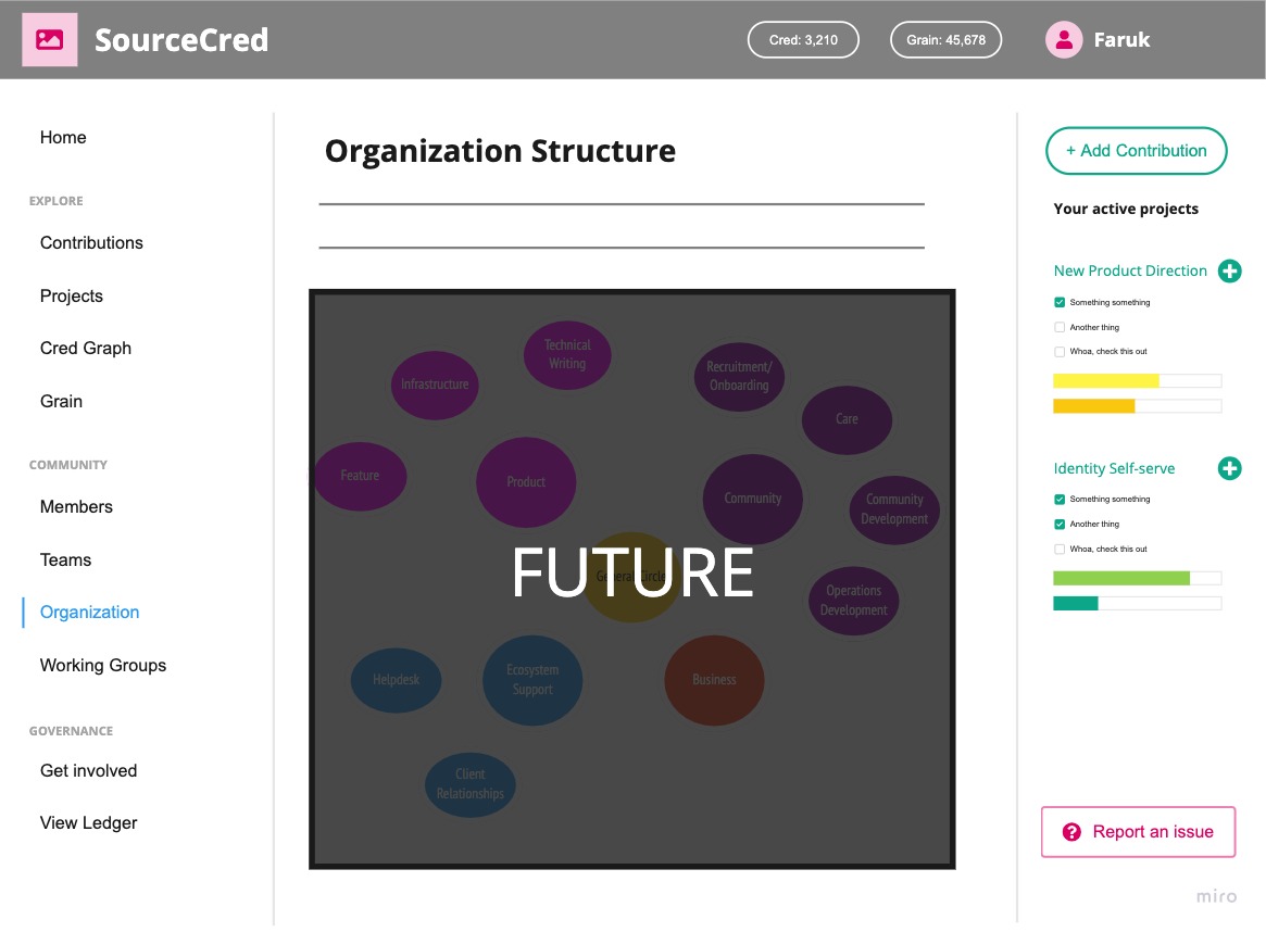
A North Star Vision

For hundreds of years, explorers and adventurers have used the North Star, Polaris, to navigate the world and keep their bearings. Its brightness and close proximity to the Earth’s north celestial pole has helped people move in their intended direction, adjust course when diverting, and find their way home.

While GPS technology has obviated much of that use case, the North Star metaphor continues to serve an important role for groups, teams, communities, even large multinational corporations to create a shared vision for people.

SourceCred does not yet have a clearly defined “North Star vision,” but we are creating it step by step. One of those steps is a vision for what a SourceCred 1.0 version might look like. The current 0.7.7 release is more like a collection of great parts than it is a whole—and I say that not as a criticism but as an acknowledgement of the value of each part. Nevertheless, it is time to think about what the big picture of this puzzle looks like, beyond each individual piece.

When we work intensely on our various products and features, we are “close to the canvas”—we see the details: the brush strokes yet to do, the corrections to make, the bugs to resolve. Every so often, we need to step back and look at the big picture: where are we? Are we still going in the right direction? And, did we just paint a completely wrong proportion for that arm?

SourceCred 1.0 needs that big picture, that North Star vision, and while many of us have it (or some version of it) in our heads, I am thrilled to offer up a very tangible vision in the form of a design concept.

The past few weeks I have been iterating on the Deep Work Creditor prototype, but the Creditor is really more a function than it is a destination. A feature more so than a product. Once I really grokked this distinction, I took a step back to look at the big picture and, with @echojuliet’s collaboration, realized that SourceCred 1.0 is a great milestone to start painting that vision—and in the case of this proposal, start discussing what we want it to look like.

The Product Of SourceCred

When we talk of the ‘product’ that people get when they create their own instance of SourceCred, I want us to think of three things:

  1. The Web App: a web-accessible, mobile-friendly, responsive application where community members and visitors can see dynamic information like recent contributions, people’s activity graphs, Cred & Grain statistics… The web app is where people go to log contributions, do Cred historianism, establish relationships for Cred flows, and so on. It is the heart of a SourceCred instance.
  2. ””” The Algorithm™ ”””: I’m being facetious with the quotes, but the SourceCred algorithm and various technologies beneath the surface of our user interfaces are an important part of the product that we offer. Without the underlying tech, SourceCred would be a product of immense manual labor to capture every micro-contribution everywhere, and it is important for us to communicate the value of this automated contribution measurement of the natural and organic human expressions of appreciation.
  3. Culture. I previously wrote about how Love is a core part of the product of SourceCred, and I believe a 1.0 release can deliver on that more literally. Our website and documentation are a great foundation, but we can take it to 11 and integrate our community cultivation and care culture knowledge as a resource in the app, to help other communities implement our most successful best practices easily from their own SourceCred instance.

We can deliver a product that combines these three pieces together with the work from our various working groups and community members, and flesh out a vision for SourceCred 1.0 that will excite, delight, and empower ourselves and our ecosystem communities!

Come join us on Discord this coming Monday 3/15, at the 11 AM (PT) Design Weekly call.

See you there!

10 Likes

Fantastic work, thank you so much for leading the charge for long-term planning with these designs. I really resonate with your breakdown of the product (app/algorithm/culture) and think that’s a great way to think about the work we’re all doing.

I’m particularly excited to start user testing and see how our ecosystem users respond to these designs & the new creditor flow!

2 Likes

On Monday morning, this proposal was presented to the team to an overwhelmingly enthusiastic reception. For those who missed it, the wireframes are below with some key explanations. There are also the following:

The Miro board whence these wireframes came:

The Roam notes for the presentation from 3/15:

Wireframes of SC 1.0 App Proposal

Below is a quick run-through of the proposed app concept. A quick contextual reminder: this proposal is meant to be an evolution of our app as seen on cred.sourcecred.io — it is not a replacement for the main website on sourcecred.io!

Home

We begin with a primary landing page for the app called Home. This anchors the member as well as any casual visitors, especially if they land on a different menu page as they get to the app. The goal of this menu re-labeling and reorganization is to create a more distinct sense of a “Community Home” page.

There is a banner for {your community name} (along with optional icon) in the top left, and a welcome message front and center. Then there are three prominent button links to explore different parts of the community, such as their contributions, who they are, or (in this example) the ledger. It’s more likely we’ll replace that with Projects or Teams when those features are ready, but that is likely post-1.0.

There are some graphs and charts below those to show the latest activity. Everything here can be whatever we want, whatever feels valuable for people to see at immediate glance upon going to the community home. Because this is intended as a “community home” page, we may want to put more feed-like content in here, or “top contributions & contributors this week,” stuff like that.

In the top right, you will find your own account info (Cred & Grain states, your profile, avatar, and a link to your member page). This is a signed-in view experience; the alternate experiences are shown later on.

Contributions

The Contributions page is the main Creditor feed, like a Facebook feed, except it’s people’s activities in the community. This page emphasizes Cred-minting contributions with filtering and sorting options, some charts, and project overviews (once we have those).

Members

This can start as our current Activity Table view, simply listing the members of the community. We’ll probably want to expand it with some more tailored views, like Top Contributions, Top Contributors, Top Platforms (for plugins-based Cred), and so forth.

Organization

The Org Structure could be visually represented here as an interactive node chart-like interface, where you can explore the org. In this page, I used the org structure proposal from the Sociocracy Working Group as an example:

The right-hand sidebar

On these screens, you’ll have also noticed the “Add Contribution” button and “Your active projects” list on the right. The bulk of that is of course only for when we have support for Projects, but the idea is that you can easily see what you’re currently working on and what some next tasks or opportunities to contribute are.

Add Contribution

The Add Contribution button opens a model to quickly and easily log a contribution you’ve made, or for Cred historians, a contribution by others. This aims to facilitate inputting contributions in an as frictionless as possible way, and ideally with some fun flourish around it to make it more enjoyable than, well, entering information in a form.


MVP breakdowns

Next, let’s quickly go through what parts of this are to be considered for MVP versus “Future” — as these screens look significantly more comprehensive and feature-rich than what we have right now, and this is not a proposal to overwhelm. Much of this will be gradual additions, as we add features and technologies to the product over time.

MVP Welcome Screen

Most of the center column is very simple: static text, static buttons, and a chart we already have. The top-right corner is for the MVP of the Identity system, and the Add Contribution button, modal, and Contributions menu link are MVP of the Creditor.

MVP Contributions

This page mainly is MVP of the Creditor, plus future expansion ideas for Projects.

MVP Members

This page is the closest to something we already have—our “Explorer” landing page—and just adds some explanation and context. We can expand it, as detailed above.

MVP Organization

The Org Structure page is very much a FUTURE expansion, not critical for 1.0 at all.

Top Menu Variations

If you are logged in, you get the account details section as shown in the wireframes so far. But what if you aren’t? And what about static SourceCred instances that don’t have an Identity service behind them?

For this section, I’m using “IDX” as shorthand for our Identity service back-end. We may yet use something slightly different, but functionally it would be fairly identical.

If not logged in but there is IDX support, there would be two separate links replacing the account details: Sign In, and Join {community name}.

For SC communities without IDX, it would be a single link saying "Contribute to {community name}” instead.

Join SourceCred (with IDX)

With IDX, we can have a clean and simple signup page that explains the single-identity system.

Join SourceCred (without IDX)

Without IDX, we can use the enabled plugins that automatically create a SourceCred ledger identity for people as the “sign up” equivalent page, with a description for each that could explain what activities on that platform will make an identity for you.

That concludes the wireframes. Please check the Roam notes to see if your questions are already answered there, and share below what you think of this proposal!

4 Likes