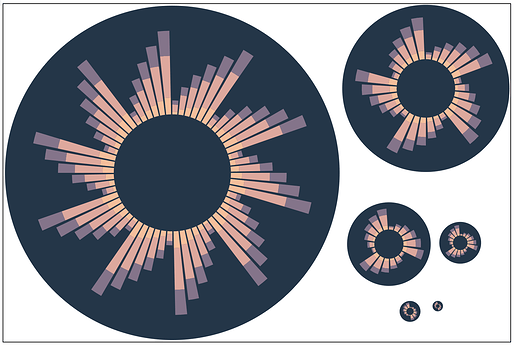
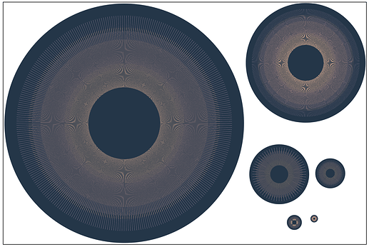
I was inspired by @ericronne’s work on the logo

to build a generator of possible SourceCred logos based on those overall themes, and along with creative assist from @lb, came up with a bunch of interesting designs. Some are potential logos, some are “just” art. 
You can play with the generator yourself here: https://observablehq.com/@decentralion/sourcecred-logo-explorations
Also, now that we have the ability to generate “sourcecred art” algorithmically, I may make an easter egg of sorts where sourcecred.io has a transforming sourcecred logo that animates and changes designs occasionally.
Please share which ones you like, and your own designs!
Thanks a lot to @LB for help with this creative process!
1 Like
I like the first one – it’s a good balance between simplicity (which is important for a logo) and conveyance of info (bar height is meaningful).
1 Like
Thanks for the feedback @jessicaschilling!
I’ve gone ahead and merged a close variant of the first version as the new SourceCred logo across GitHub, this forum, etc. 
1 Like
The first one looks good to me too!
1 Like
Thinking of ways to make the forum more engaging and fun. Having a logo and visual component to important posts could really help make the Discourse feel more like “home” and less like any other forum. All that to say, thank you everyone here who worked on marking the logo and art stuff happen for the community 
@ericronne / @LB / whoever has the source files (or access to whatever service/tool created these images): We’ve been using this first logo in lots of places now which is great, because I love it.
Request: I’m wondering though if someone could make a version of this with 11, 12, and 13 spikes?
Purpose
For the design system, I would love to have some versions we can use as fav icon, emoji, and any other small icon purposes, that are very distinctly recognizable but not too fiddly with the details. We can use @2x res for it because hi-dpi screens are ubiquitous enough, so it doesn’t quite have to be pixel-perfect at 16x16, but 32x32 to 128x128 would be amazing. Also I’m curious to see a larger version at 11–13. 
Alternating heights
The 12 version could have a consistent alternating height like this one does now.
The 11 & 13 versions, I would love to see using a somewhat randomized distribution of 3 different sizes of alternating heights, kind of like how the 2nd logo variation above does it.
Priority: LOW
@KuraFire you can play with the logo generator yourself. Click on any logo board to see the code generating it, and you can tweak it and generate a new logo:
The actual “official” logo is located on GitHub. Note we have copies rasterized at different sizes in that directory. It wasn’t generated from that Observable notebook, but from the logo generating code in the old website repository, which also has code for rendering animated logos, etc.
The official logo was hand-tweaked by @wchargin to make a cleaner SVG, so if we want to re-generate a logo at “official” quality we should port those tweaks into the logo render module linked above.
Also, @wchargin is on record saying we should have a clean multiple # of spikes, so 12 would be a good pick.
In particular, since hex stickers seem to be all the rage, having 6-fold
rotational symmetry is quite nice.
@decentralion thank you! I made this, which on the smaller sizes works quite well I think:
1 Like


